There are so many logos with hidden design elements that either make a subconscious impression or, better still, create a memorable moment of insight when you finally spot the second meaning. Here are some of the most effective.
The world-famous annual cycle race, the Tour de France, has a very clever logo in which a cyclist is hidden in the typography. They also use the all-important yellow splash to call to minde the yellow jersey that is awarded to the victor.
The London Sperm Bank not-so-subtly hints at its services:
Pitsburgh Zoo and PPG Aquarium make excellent use of both figure and ground here:
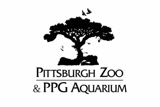
The animal images are beautifully rendered and the fish at the bottom only appear on the second or third glance. This logo keeps on rewarding the viewer.
The Ignite Christian youth conference also makes excellent use of positive and negative elements:
The Pentecostal flame reveals a dove of peace.
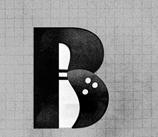
This image from Seriousron’s portfolio is a fantastic idea for a bowling alley – the pin and ball are represented within the type:
Another fantastic juxtaposition of typography and graphic elements can be found in the Pencil logo:

Saul Bass’s 1978 Girl Scout logo is beautiful both in its clarity and in the way that repeating elements in positive and negative space send a message about inclusivity:

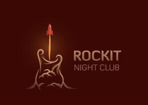
This logo for a night club cleverly contains both a guitar and a play on the club name:
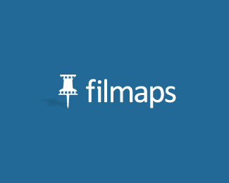
Film location guide, Filmaps, has a logo that cleverly combines two icons: the film strip and the push pin:
And finally my absolute favourite: the Hope for African Children initiative.
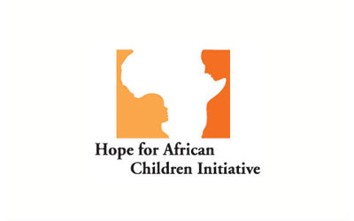
At first glance it’s nothing but a negative-space outline of the continent of Africa, but look at the ground more closely and you’ll see a Rubin-vase-type image of a child and an adult looking at one another. It combines all of the important elements of the brand in one powerful and moving image.
These examples show how you can combine symbols, use positive and negative space and even mix typography with graphical elements to make a memorable logo that is fun and impactful.
